Pages

Tuesday, February 25, 2014

Nicecrane Designs Sponsor Spotlight No.3

Welcome back to the final Sponsor 'Spotlight' for this month. 


 Nicecrane Designs has been our sponsor this month and for the winner of the prize draw this month there will be a $20 voucher to spend on some gorgeous digi images at the Nicecrane store!

     For my creation I chose to work with the Bessie Gutmann images - They are so gorgeous!


     In this collection you get two sets of the images - coloured and line drawing images. I chose to work with the line drawing.

      I was inspired by our Guest Designer last month. Trace from inkypinkycraft who had used some burlap panels. I was very keen to do something similar. I didn't have any of the actual panels so I made my own with mount board, painted with Frayed Burlap DP and covered with burlap sheets.


     After the burlap was stuck down I began to decorate the panel.

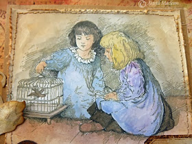
     The picture of the little girl on the swing was painted with Picket Fence DP to act as a resist for the ink. The Distress paint isn't very opaque, so it is great to use for this...just a light brush of paint and you can still the detail underneath.


 When dry I blended Frayed Burlap DI over the image and then cut it out and stuck it onto ivory card.


       I stuck it to the panel and began to decorate it with some tissue tape


   I added an ivory rose that had been dabbed with Frayed Burlap DI. I stuck some delicate crochet lace and a rustic button alongside the rose.


I added a twine bow


     I used some Tim Holtz Alpha parts for the words....I decided to use the words 'Live, Love and Laugh'. I stuck the letters down onto card and painted them (and the card surrounding them) with Antique Linen and Frayed Burlap DP. I loved how the paint didn't cover very well, leaving a rustic tarnished look to the letters.


     When dry I peeled the letters away from the card and inked the card with Walnut Stain and Frayed Burlap DI.


    I tore around the edge of the words. I would normally have inked the torn edge, but I decided to leave it un-inked to add some contrast.


     So where did the other words go?.....well, this one is part of a set of three.....


 I mixed up the words so none matched and used a different image and tissue tape on each. They all have roses dabbed with frayed Burlap DI, twine string tied into bows and some natural coloured buttons.

I loved making these panels - I do hope that you have enjoyed visiting our Sponsor Spotlights this month. It has been lots of fun showing you just a few of the many ways these gorgeous images from Nicecrane Designs can be used in your own creations!

     There are only three more days of Jenny's 'Three colour challenge (without the use of black)'- why not get over there and join in the fun? You could be the lucky winner picked by Random.org who receives $20 to spend in the Nicecrane store! - and of course there is always the 'Top Talent' spot to be won and you could also be picked as one of our Top 3!!! - You have to be in it to win it!

     Hope you will all come back to see the wonderful challenge Linda has planned for you on 1st March! I know you will love it!


   See you then!

Laura xxx

Saturday, February 22, 2014

A Very Vintage Christmas Top Talent


Welcome back to another Top Talent spotlight at Our Creative Corner!
  
    This month we are shining the spotlight on the winner of the 'A Very Vintage Christmas' Challenge that was hosted by me!

     Our Creative Corner is so pleased to be welcoming Ana from anina-papirckalnica who won the Very Vintage Christmas challenge with her
stunning altered box.

     
     As usual, before we show you Ana's amazing creation - let's find out a little bit more about this very talented lady.......


1.) Where do you live?

I live in beautiful Slovenia in little town Kocevje. We have the largest old-growth forest (also primary or virgin forest) in Central Europe, habitat for many wild animals, like brown bear, wolf, fox and lynx.

2.) What do you enjoy most about crafting?

I love to say that crafting is my escape from reality. When I am in my "craft space" I can really clear my mind, forget about everyday problems and just enjoy.

3.) If you lose your Mojo, what do you do to get it back?

Usually I just go visit my blog friends at their blogs (few of them are very talented designers here at Our Creative Corner)….there are so many talented people around blog land, it is impossible to leave without inspiration. I also find inspiration in the nature...as my other “big love” is collecting mushrooms, I love to spend my free time in the forest and just a quick look around it’s enough to have a new idea in the head.

4.) How do you react should an item you are working on ever go 'wrong' - or should I say 'not to plan'?

If there is no chance to hide or fix "the mistake", I throw everything away and start all over. I learned that this is the easiest way to avoid stress...lol.

5.) Please tell us about any items in your craft stash that you can't be without? What is your favourite 'must have' item for crafting?

I can’t “live” without Distress inks (Vintage Photo and Walnut Stain; it is obviously...lol), good scissors, scalpel and glue.

6.) Do you pre-sketch a design or just wing it? How long does it usually take you to make a project?

No way.... I just go with the flow. Some projects turned out completely different from what I had in mind at the start. I am mostly a weekend crafter, so I try to finish the project during those two days...usually I have the base done very quickly in 1 or 2 hours, it all depends what I am creating, but I am a bit of a perfectionist and I need more time for details, sometimes I am not happy with end results for a few days....

7.) How do you spend your time when not crafting?

At the moment (last few years...lol) I don't feel like I have much free time, but beside crafting I enjoy nature - listening to the sounds of birds or rain, seeing the stars at night, collecting mushrooms ... I love spending my free time in the nature.


Ana has created one of her wonderful books for all of us to see - how amazing is this?


Thank you Ana for being an amazing Top Talent in the spotlight for us today..... and thank you also for taking the time to design such a gorgeous project for us. It has been such a pleasure to feature your work.

     If you want to see more photos and details of how it was made, then please go along to Ana's blog 
anina-papirckalnica and say "Hello" - I am sure she would love to see you there!


                    Would you like to see your work here in the 'Our Creative Corner' Spotlight?


You could be here as our 'Top Talent' with the spotlight shining on something you have created! All you have to do is enter Jenny's 'Three Colour Challenge'

You could also be one of our Top 3 and there is even the chance to be 
the winner of the $20 to spend at the Nicecrane Designs store - kindly donated by our Sponsor this month - 'Nicecrane Designs'
            
          There is one more week of Jenny's challenge left, so why not have fun creating!
    
   Don't forget that I will be back here on the 25th to show you my Nicecrane designs  Sponsor Spotlight! I hope you will all come back to see what I have made!

Tuesday, February 18, 2014

Nicecrane Design Sponsor Spotlight #2

Hello everyone and lovely to have you visiting here at Our Creative Corner.
Today I am sharing the second project for our sponsor spotlight.
As you may know already Nicecrane Design is our wonderful sponsor this month.

Anyone who joins in this month's challenge, Just three Colours could be randomly picked to win a $20 voucher for Nicecrane Design Collage sheets. If you don't know him, check him out! He supplies the most amazing collection of digital images, - there is bound to be something for every taste, there is so much to choose from, you will not be disappointed!!


I chose to work with this amazing collection of digital stamps and had so much fun colouring my chosen image!
New and True

Digi stamps don't only save lots of space of course, but the great thing is that you can re-size them to fit your project.
Here is a close up of the stamp I chose. I coloured it with some Faber Castell Big Brush markers, which I had scribbled on my craft mat and then picked up with a refillable water brush

I created a large 9 by 7" card, which eventually will become the cover of a journal. I used a wonderful vintage paper collection from Kaisercraft's Sweet Nothings" collection and over-stamped in various areas with some background stamps, also from Kaisercraft.
I heavily distressed all the edges of my paper, then stitched around it and adhered it to a cream coloured card base.
It was embellished with various die cuts, flowers and a rusty heart.
I also added some lace for a vintage feel to match the lovely vintage stamp.
A sentiment from the Tim Holtz Simple Sayings set and some pearl brads finishes it all off.

Well, hope you liked my sponsor spotlight. Laura will show you another amazing project on the 25th. Don't forget to come back for that.
Thank you for visiting today, and if you have not done so already, we all hope you will join us still for our February challenge, and remember, one randomly chosen winner could be the lucky recipient of their favourite Nicecrane collage sheets!
Have a wonderful day and stay inky!!

Tuesday, February 11, 2014

And the surprise Guest Designer for February is...

As the host for this month's Our Creative Corner 'A three colour challenge', I am pleased and proud to introduce a very special Guest Designer for February...

Toni (otherwise known as the 'Artistic Craft Dabbler')

This incredibly talented lady has no fear of using colour and a natural artistic talent that allows her to create some stunning work. For this reason I knew she would take this challenge in her stride and come up with something to delight and amaze you. Guess what, I was right!

****************************

I was very flattered and excited by Jenny’s invitation to be February’s guest designer for Our Creative Corner. To follow in the footsteps of previous guests, Lynne Moncrieff from Adorn and Trace from Inky Pinky Craft, is indeed an honour. Lynne was one of my very first blog friends and I’m a great admirer of her wonderful romantic style. Trace’s work is always inspiring. I love her subtle use of colour and texture.

When I found out that Jenny had set the challenge theme for February and she had chosen to use a restricted colour palette, with shades of brown, purple, plum and blue, with no black lines allowed, I must confess I was a little nervous. I’m not entirely sure that I’ve ever created a project without a smidgen of black Archival ink featuring somewhere! That is of course until now......So, without further ado, here is the project I’d like to share with you. As February is the month of romance, I’ve chosen to make this canvas as a tribute to my lovely late grandparents.


I’ve used a copy of a photograph of them on their wedding day which was the 24th December 1930. I thought the sepia tones would fit the challenge theme perfectly. My grandma looks so pretty with her beautiful dress and trailing bouquet. My granddad looks pretty handsome too. I love that he’s holding a bowler hat and a pair of white gloves. I can’t imagine that he would have actually worn them on the day.


I started by applying some texture paste through a Tim Holtz ‘ Dot Fade’ Layering Stencil. I left this to dry and then added more paste using Wendy Vecchi’s Flourish stencil. I did this in sections, leaving each part to dry so that I didn’t smudge and flatten the raised areas. I then gave the surface a coat of white gesso, before painting with Distress paints in Antique Linen and Frayed Burlap.


Whilst this was drying, I made some flowers from manila card, using a small Movers and Shapers Tattered Florals die. I really like making flowers, with these dies. It’s a little fiddlesome but it’s very gratifying. In no time at all you can end up with a whole bunch of flowers ready to be painted or inked or both as is the case with these.


They’ve been painted with distress paints, and sprayed with Dylusion Inks and Perfect Pearls Heirloom Gold. They are amazingly resilient! So, flowers made, time to get back to the canvas. I took the plunge and started to spray the surface using my mini misters with diluted Distress Re-Inkers in Aged Mahogany, Chipped Sapphire and Vintage Photo. I sprayed and blotted the inks with a cloth to stop the colours from being too intense, once I was happy with the effect I dried the canvas with a heat tool.


The next stage was to highlight the flourishes with a little Treasure Gold, and a little more stencilling. This time, with ink rather than paste, I used Wendy Vecchi’s Archival Ink in Hydrangea, and a Trellis Layering Stencil.


Everthing was now ready to start assembling the canvas. I layered the photograph onto dyed watercolour paper, and card, then added the metal corners, which have a little Treasure gold on the surface. The flowers were secured with Matte Multi Medium and I finished off, with a die cut leaf and a little tag, handwritten, with my grandparents’ names and the date of the wedding.


I’ve enjoyed the challenge of using a restricted colour palette and will definitely try this again. It’s so easy to reach for the black ink but I hope this project shows that you can keep the lid on it, once in a while!

Many thanks to the wonderfully talented team at Our Creative Corner for inviting me to be their guest designer this month and don’t forget to upload your entry into this fabulous challenge and remember... no black lines !

Toni x

Saturday, February 8, 2014

No More Shopping Sins! - Winners and Top3

Servus and welcome back! Claudia here to announce the winner and Top3 of my "No More Shopping Sins!" challenge.

I can tell by the great number of awesome projects you entered that you enjoyed using some of your hoarded stash as much as the team and I did ;)
A huge Thank-You once again to all who joined in - I enjoyed visiting each of your blogs - seeing your creative makes and reading your "confessions". Now that we know that we are not alone in this, we can "sin" a lot easier, can't we? *giggle.


Thank you so much to Crafty Individuals for being our sponsor this month. The winner of the prize was chosen by Random.org and the lucky winner is........

No 74 - pearshapedchris!

Well done! Please send us an email and Laura will send the prize to you!


   And now - without any further ado - to the winner and Top3 I chose (and it was definitely hard choosing....good gracious - you all really rocked that challenge):


And my winner is


I adore the couragiously clear and striking design of this card and especially the fact that the pure black colour she used for her selfmade background plays a main role in this make. I also love the heat embossed texture she created with the marker cap - it's as genius as it is simple and I love this kind of out of the box thought stuff! I especially like that her card follows a rather "simple" design, but as it is not a "clean and simple" make all the distressed edges, tiny elements  and textures (brush strokes, eyelet and shiny heat embossed circles) step forward and become the key to this intriguing design. Artful card making at its best!


My Top3
 (in no particular order)


In my opinion it is one of the most difficult things to use stamps that are as dominant as this one is without letting added elements look unimportant for the whole design and just...well..."added". Pia did an excellent job on her card as the clear quote and the highly textural ribbon formally even enhance the impression of the stamped image! An awesome card!


As a great admirer of Barbara's talent to work with vivid colours combined with highly graphical elements this wall hanging is once more proving her ability to create the most impressive "mini posters" as I call them. Having learned a bit about lay out and poster design I especially adore this quality on most of her gorgeous makes. I recommend you hop over to her blog (and of course to the blogs of the other winners too) to check out the details like the colour sprinkled butterfly or texture embossed silhouette.


Shirl worked her magic with bees wax on this gorgeous hanging and I love the warmth and softness that come with her make (and as a lover of insects I love the bees theme too ;)! And take a closer look: the way she created the hanging for her tiny bees wax collage is just so stunning cool - I HAVE TO try this too as it is not only ecology-minded but also veeeery creative and perfect for paper crafts or any other mixed media projects! A brilliant idea for recycle art, isn't it?

*

My sincere congrats to the winners! Please, feel free to grab the badge for display on your blogs! 

***

Our current challenge "Just Three Colours" - hosted by lovely Jenny (Buttons) - has just started, so you can join in the fun! (please, make sure you read the challenge theme properly)!
By joining the challenge (with a make that follows the theme and our challenge rules) you could win and thus become our Top Talent here at Our Creative Corner or one of our Top 3!
You could even end up with a wonderful prize from Nicecrane Design! Can't wait to see you entering the new challenge! 

Claudia x

Tuesday, February 4, 2014

Nicecrane Designs Sponsor Spotlight

Welcome to this month's 'Sponsor Spotlight'.

Our sponsor this month is Nicecrane Designs

Nicecrane Designs

Our Creative Corner are so excited to be working with Nicecrane Designs, who supply the most fantastic range of reasonably priced digital images to suit every taste.


I went very retro with this card and chose to work with three of the Valentines collections;

Be My Valentine CS - Click Image to Close

Romantic Valentine Collection 1 - Click Image to Close

Romantic Valentine Collection 2 - Click Image to Close

I love the seasonal collage papers that are part of the Idea-ology range and realised that by combining my own choice of images from these digital collections I could create my own bespoke background. If you haven't tried something like this before it is pretty easy. You can resize the images and insert them next to each other on a blank page.


Just like those bespoke papers, I wanted a more vintage feel. By brushing Antique Linen Distress Stain to the background, drying it thoroughly, sanding it lightly and applying Walnut Stain Distress Ink to the edges the separate images blended beautifully.


If you are going to layer elements onto a background it is always a good idea to trace around the main shape so you can work out where to place everything underneath it. This also helps if, as in this case, you want to apply stencilling and spritzing with inks and paints. I used white to do both and add some contrast to the background/foreground.


I was careful to choose card colours that coordinated with the main colours in the background images. It's one of my 'design principles' - complicated background, simple foreground. The heart was coloured with Red Geranium Archival Ink before being covered in clear Rock Candy Crackle Paint and a thin layer of Matte Multi-Medium.


It always makes a difference to add Walnut Stain Distress Ink to the edge of every element, taking away that harsh white colour. The ink also helped to highlight the embossed areas. And with a sentiment added, matting the background gave the card a frame.


I really hope you enjoyed this Sponsor Spotlight. There will be two more this month featuring Nicecrane Designs, hosted by Astrid and Laura.

And don't forget to join us for this month's 'A three colour challenge'. You could be picked as one of our Top 3, or even become our Top Talent with the opportunity to showcase your work here at Our Creative Corner. One of our lucky entrants will even be picked at random to receive a wonderful prize, kindly donated by Nicecrane Designs.

Take care of yourselves, Jenny xxx

Saturday, February 1, 2014

A three colour challenge (without the use of black!)

Welcome to this month's Our Creative Corner challenge.

This time the challenge is to use only shades of BLUE, BROWN and PURPLE/PLUM - NO BLACK &WHITE IMAGES or BLACK LINES even on your stamped or digital images!!!

You can definitely use stamped or digital images if you want to, but you must change the colour of the image or lines in your image to a shade of brown, blue or purple. White is acceptable as a base, for example a white card blank, but shouldn't be a main colour. Anyone submitting projects containing anything other than blues, browns and purples/plums will immediately be disqualified to make it fair to the other entrants.

This month we are delighted to confirm that one randomly drawn winner will receive a prize from our generous sponsor Nicecrane Designs.


Colour is an important part of the creative process for me. I will often start by choosing the colour palette for a project before finalising the design, and as time has gone on I've learned to try to limit the colours to a maximum of three. This works for me and I'm excited to see if it is equally successful for you.

A useful tip for those who have never changed the colour of the lines on their digital images; this is easy if you use one of those image or photo manipulation programs available for free on the internet. They will contain transformation tools that make everything sepia, for example. Go on, give it a go. We'd love to see your tags, ATC's, cards, canvases, journalling, 3D art, etc.

Let's get you started with some fabulous inspiration from the Design Team.


As well as sticking to the colour palette for this challenge, I wanted to show that it is possible to use digital images without having those harsh black lines. And just wait 'til you hear what I printed the main image onto!


Jenny's color challenge had me running scared for a bit. I struggled trying to come up with a design but once I relaxed, sat down and just played, it all came together. I ended up with a mixed media piece that I really like and I totally appreciate Jenny's nudge out of my comfort zone!


This challenge had me scratching my head for a while but then I got out my Kraft card, a stamp, some tea dyed backing paper, some dies and stencils along with some Archival ink and I had great fun in the end!


A great challenge from Jenny but I had to really think about this one! For some reason the colour combination made me think of a contemporary design with perhaps geometric shapes. I selected the paints I felt were a best match and started playing on card using some stencils and stamps. This didn't quite work for me so I tried the same colours on fabric (with an additional medium added so the item can be washed) and I ended up making this case for my glasses which I'm always losing! I love to sew and it was great fun to combine this with my other passions: paint, stencils and stamps.


I decided to make a tag in a bag for this challenge, one of my favourite types of projects. I also used some of my all time favourite techniques and products, Distress Stains and Inks. As to the colours? Well that was a real challenge! I love browns and blues, but purple??? But hey, there is nothing like a challenge right? And I have to say, I had great fun creating mine, despite the colour challenge!


I too found this a bit difficult - mainly because I very rarely use my purple inks and paints. So this challenge gave me the push I needed to use those gorgeous colours...and of course the choice of embellishments for Jenny's challenge was an obvious one!


As I only recently bought a recycle kraft paper sketch pad at the 1 Euro store, I decided to let the  beautiful natural brown of the paper be the main focus on my tags. As the brown of the paper changes the colours you stamp on, some of my "dusty concord", "gathered twigs" and "rich cocoa" stamped lines turned out really dark brown - purpl-ish...in fact a lot darker than I expected. Actually I love this as it looks a lot "richer" in tone than black lines could ever be.


So now it's over to you! Remember those rules - browns, blues and purples only and definitely NO BLACK. We have a prize and a Guest Designer spot up for grabs so there's every reason to join in the fun.