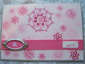
Here are the samples from our team to get you started. This post is heavy with pics, but they are absolutely worth it to see the transformations everyone created!
Lori Rider - The Diva Stamper
The original card - one of the first I posted on my blog in 2007.
For my makeover I used similar colors and types of images, along with a similar background technique.
Christina Barnes - Dot Dot Stamping
The original.... made in the first few weeks after I first started stamping, and blogging for that matter!

My makeover card...keeping the grid technique on the background, various shades of pink, and a similar layout.
Lisa Minckler - You Made Me Ink!
I chose to keep the lattice work
Original Card
Make-Over Card
Susan Butler-scrumplescrunch
Original card. (what was I thinking!)
Make-over
I liked the bird and the water-colour Bg.
Paula - Scrap Addicts Attic
Here's my old card I made sometime during 2011, really don't care for this paper at all (why did I buy it?) and find the overall card boring
I really like the stripe background & the bling
Meihsia Liu - Simply Paper Crafts
Original Card - I must be in a very good mood
so I put everything on this card...
Make Over - Same sketch
but interpret in different way
Kim Price - Inkognito
My original card made a few years ago - I love the colour scheme used here and I'm still infatuated with butterflies so I used both these elements.
Makeover - My love of layers, colour and fussy cutting is still apparent in my new version.
Linda Coughlin - The Funkie Junkie
This card was originally made right after I started with the OCC in September 2009. You can see it here on the OCC blog and here on my personal blog.
For my makeover, I wanted to keep the same feminine romantic theme,
but wanted to lighten and brighten it.
Liliana Inguanti - Stampin' From Home
This card was from my pre-blogging days. I like the design, but find it dull and boring and too monochromatic. I actually cringed when I found this one in my stash, lol.
Here is my makeover card. I kept the overall design but you can see how I learned to combine colors to bring the card to life, and create contrast to make the design elements "pop."
Anita Houston - The Artful Maven Haven
The Original (Yes, it's the one from last week...I hated it.)
The Make-over (I kept the inky background.)
Irena Kowalczyk/Rudlis - love, life and crafts
My first card. It was created in 2008.
Make-over: I changed the background and added a little elements.
Also, they are stitching.
Holly Kean - Kean On Paper
My first card was made September 2011.
This was one of my first OCC cards. I'm not sure what I was thinking with any of it.
For my makeover version, I used the same layout (rotated it 90°) and colors of light blue and pink.


Oh wow; what a fun challenge! I truly enjoyed looking at the evolution! Great job, ladies.
ReplyDeleteHugz,
Sandy
What fantastic re-creations love this. Thanks for sharing all your transformations.
ReplyDeleteWow, this looks like a fun challenge! I can't wait to browse through some of my old cards and see what I can make better!
ReplyDeleteI´m smiling :) what a FUN :)
ReplyDeleteBeautiful works ... I cant say your past cards looks not good ;) I like some off them :) Lilian ;) :)))
Anita great changes off the card ;)
Love inspirations from all of you.
I just yesterday look´t at my old cards :) I´ll try to make something because I love makeovers :)
Regards ,
What an interesting challenge. The DT samples were fun to see. A challenge indeed.
ReplyDeleteSuper inspiration from the DT, love the makeover idea.
ReplyDeleteCurious about something, a winner hasn't been announced for the Bakin' Beauties challenge a few weeks ago. Will there be one?
Loved the challenge again. Like Lisa I was wondering about the Bakin Beauties winner, I thought that it was just me loosing the plot. Glad I'm not alone lol.
ReplyDeleteLooking forward to seeing what you challenge us with next time
hugs Kimx
I really loved doing this - cringing & looking at how much I've changed!
ReplyDelete